Can You Decode The Secret Meanings In These Brand Logos?
Le Tour de France
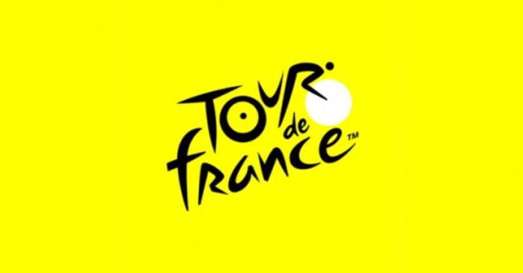
At first glance, the Le Tour de France logo might appear straightforward, perhaps even deceptively simple. But like many great designs, there's more than meets the eye. Have you ever taken a closer look at the sun in the logo? It's not just a radiant celestial body. Ingeniously, it doubles as a bicycle wheel, seamlessly integrating with the event's theme. Furthermore, the letter "O" in "Tour" complements this wheel, while the adjacent "R" is artfully crafted to depict a cyclist in motion. This clever design encapsulates the essence of the world-renowned cycling race, blending subtlety with unmistakable symbolism, and celebrating the spirit of the competition.